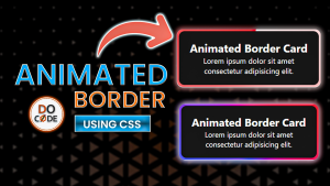


✨ Animated Border Card with Conic Gradient
This tutorial explains how to create a beautiful animated card with a glowing conic-gradient border using modern CSS features like @property and ::before/::after pseudo-elements. No JavaScript is needed!
✅ Live Demo
📌 Step 1: Basic HTML Structure
We start by creating a simple HTML layout that includes a single card with some text inside.
<div class="card">
        <div class="content">
            <h2>Animated Border Card</h2>
            <p>Lorem ipsum dolor sit amet consectetur adipisicing elit.</p>
        </div>
    </div>
🎨 Step 2: Basic Styling and Layout
We apply general styles for centering the card and giving it some basic aesthetics.
- Body: Full height, flex centered, light background.
- .card: Relative positioning, text aligned center, and isolated to layer pseudo-elements correctly.
/* General Styles */
    * {
        margin: 0;
        padding: 0;
        box-sizing: border-box;
    }

    html,
    body {
        width: 100%;
        height: 100%;
        position: relative;
    }

    body {
        font-family: 'Segoe UI', Tahoma, Geneva, Verdana, sans-serif;
        background: #f1f1f1;
        height: 100vh;
        display: flex;
        justify-content: center;
        align-items: center;
        padding: 1rem;
    }

    .card {
        width: 300px;
        text-align: center;
        position: relative;
        isolation: isolate;
    }
🧱 Step 3: Styling the Card Content
We create a .content block inside the card for actual content. It has a dark background, white text, and some padding.
.card .content {
        background-color: #111;
        color: white;
        padding: 20px;
        border-radius: 12px;
    }
⚙️ Step 4: Using CSS @property for Animation
To animate a CSS custom property (variable), we use @property. It allows smooth transitions for angle rotation:
@property --angle {
        syntax: "<angle>";
        inherits: false;
        initial-value: 0deg;
    }
This enables us to animate the --angle variable in conic-gradient.
🌈 Step 5: Adding Animated Borders with ::before and ::after
We use both ::after and ::before pseudo-elements to create the border effect:
- ::after creates the colored animated border.
- ::before adds a blurred glow effect.
.card::after,
    .card::before {
        content: "";
        position: absolute;
        width: 100%;
        height: 100%;
        background: conic-gradient(from var(--angle), red, blue, purple,red);
        z-index: -1;
        border-radius: 12px;
        padding: 4px;
        /* it act as width of border*/
        /* 1st way make it center */
        /* top: 50%;
        left: 50%;
        transform: translate(-50%,-50%); */
        /* 2nd way to make it center */
        top: -4px;
        left: -4px;
        /* add animation */
        animation: rotate 3s linear infinite;
    }
The padding value here creates a visual border thickness.
💡 Step 6: Adding a Glow with Blur
The ::before is styled with filter: blur() and opacity to create a glowing halo around the border.
/* add glow */
    .card::before {
        filter: blur(1.5rem);
        opacity: 0.5;
    }
🔁 Step 7: Animate the Angle with Keyframes
Now we animate the --angle CSS variable using keyframes to make the gradient rotate continuously.
@keyframes rotate {
        from {
            --angle: 0deg;
        }

        to {
            --angle: 360deg;
        }
    }
✅ Final Result
You now have a modern, glowing card with an animated conic-gradient border using pure HTML and CSS!
Browser Note: This effect requires support for @property, which is currently available in Chromium-based browsers like Chrome and Edge. Firefox and Safari do not yet support this feature.
📩 Connect With Me
- 🌐 Website: DoCode
- 📧 Email: docode537@gmail.com


